Paper-cut posters can feel this deep
Create refined layered paper-cut editorial posters revealing deep narrative scenes inside a bold silhouette.
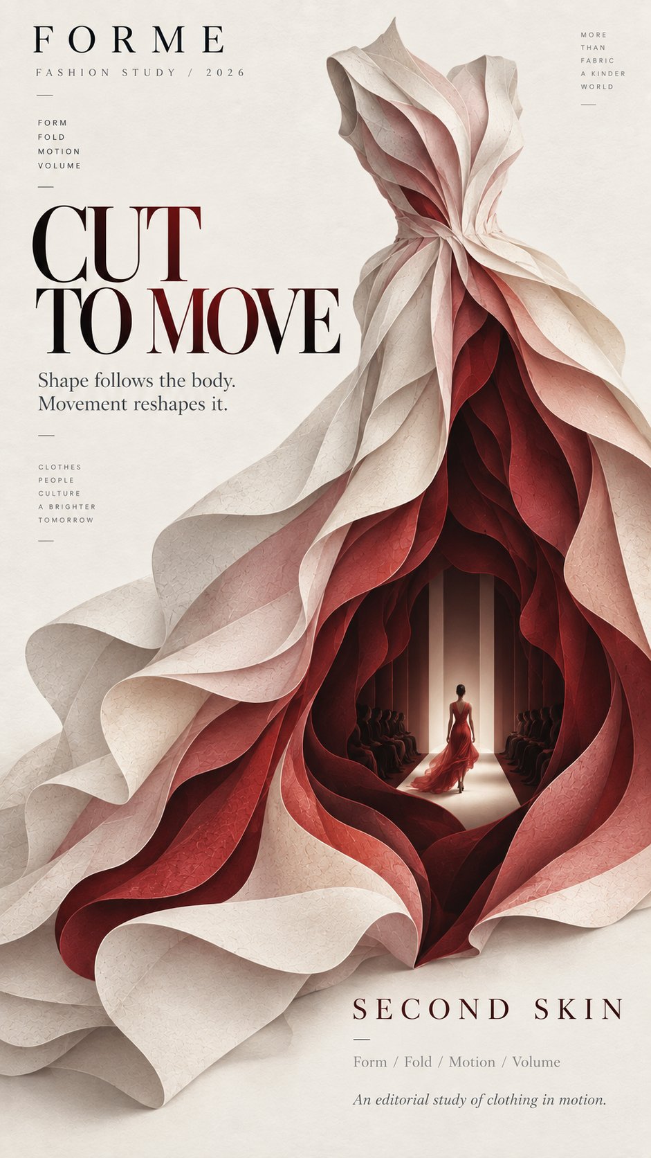
Type: AI-Generated Community Prompt. All sample images are generated via AI models and serve as baseline references only. Prompts are parameterized for transformative search & educational customization.
Report Copyright / Takedown Request
Prompt Template
Theme: {theme_materials}
Title: {main_title}
Main silhouette: {main_silhouette_materials}
Inner world: {inner_world_materials}
Color palette: {color_palette}
Editorial tone: {editorial_tone_materials}
Aspect ratio: {aspect_ratio}
Create a refined layered paper-cut editorial poster built around one bold, instantly recognizable silhouette.
Let the main silhouette occupy around 60–70% of the composition. Inside it, create 6–9 layers of cut paper that gradually open into a deeper space. Each layer should follow the overall shape while changing naturally in scale, direction, and contour. Avoid perfectly even or mechanical concentric layers.
At the deepest point, reveal a small narrative scene related to the theme, such as a runway, underwater world, observation platform, courtyard, or another meaningful environment. Add one very small human figure when appropriate to create scale and a sense of discovery.
Use matte art-paper textures, clean cut edges, subtle natural paper fibers, and soft shallow shadows between layers. Keep the result visually flat and editorial rather than heavy 3D, foam-board, plastic, or CGI.
Use a restrained palette of 3–5 colors, moving from lighter outer layers to deeper, darker inner layers. Keep colors clean, solid, and consistent rather than using digital gradients or distressed textures.
Leave generous negative space for typography. Use a clear editorial hierarchy with one strong title, a small project or issue name, and only a few supporting details. The typography should feel like an art magazine, exhibition poster, fashion editorial, or cultural publication.
The visual rhythm should be: bold silhouette first, layered depth second, hidden inner world third.
From a distance, the poster should read as one strong shape. Up close, the viewer should discover the layered paper structure and the small world hidden inside.
Variables
- Main Title (main_title) - text
- Color Palette (color_palette) - text
- Aspect Ratio (aspect_ratio) - select
- Theme (theme_materials) - select
- Main silhouette (main_silhouette_materials) - select
- Inner world (inner_world_materials) - select
- Editorial tone (editorial_tone_materials) - select
Tags
paper cuteditorial postersilhouetteminimalistgraphic design