Handwritten Signature Concept Sheet
Transform any plain text name into four distinct, professional handwritten signature concepts presented in a clean grid layout.
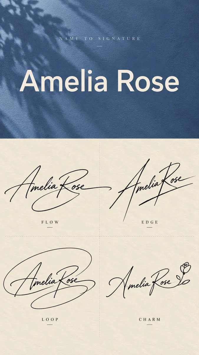
How to use this prompt
This template excels at generating professional presentation sheets that convert a standard typed name into four distinct handwritten signature styles. It is best suited for modern diffusion models capable of handling structured layouts and typography, performing ideally at a 9:16 vertical or 3:4 portrait aspect ratio.
To achieve the best results, pair your chosen Name with a complementary Top Background Color that sets an appropriate mood, such as deep burgundy for executive looks or dusty blue for creative branding. Ensure the aspect ratio matches your layout goals so the two-section grid structure renders cleanly without distortion.
A common pitfall is text corruption or unintended gibberish in the top typed section, which can be mitigated by keeping name inputs concise and running multiple generations if needed. Additionally, models sometimes crowd the 2x2 grid, so reinforcing the prompt parameters helps maintain clear separation between the flow, edge, loop, and mark concepts.
Prompt Template
[Name]: {name_input}
[Top Background Color]: {top_background_color}
[Final Ratio]: {aspect_ratio}

Create a vertical {aspect_ratio} "Name to Signature" design sheet that transforms one plain English name into four clearly different handwritten signature concepts.

Use two sections. The top 40% shows the original typed name, and the bottom 60% shows four signature designs.

For the top section, use the selected muted background color with subtle paper or fabric texture and a soft natural shadow. Add small widely spaced text at the top:

NAME TO SIGNATURE

Display the original name in the center using a large, clean neutral sans-serif font such as Helvetica, Arial, Inter, or a similar modern typeface. This must look like normal typed text, not handwriting. Keep the layout minimal and do not add extra slogans or decorative copy.

For the bottom section, use a warm ivory paper background with very subtle grain. Divide it into a clean 2×2 grid using faint thin dashed lines, with no outer border.

Create four large black handwritten signatures for the same name. They must be noticeably different in silhouette, rhythm, stroke direction, abstraction, and personality. Do not simply generate four similar cursive versions.

Use realistic gel pen or fountain pen handwriting with natural pressure variation, lighter entry strokes, stronger main strokes, tapered endings, and slight ink irregularity. Letters may merge, stretch, overlap, simplify, share strokes, or become partially abstract. The goal is signature design, not perfect letter-by-letter readability.

FLOW: Create a graceful, fluid signature with smooth connected strokes and one or two long sweeping tails. Keep it elegant, natural, and believable as a real personal signature.

EDGE: Create a sharper, more directional signature using stronger slant, tall vertical accents, pointed turns, crossings, and decisive endings. Make it modern, confident, and fashion-forward.

LOOP: Build the signature around a large expressive looping gesture. Compress parts of the name inside or across the loop, and allow one stroke to extend outward as a strong finishing motion. Keep the loop organic and handwritten rather than geometrically perfect.

MARK: Create the most minimal and abstract version. Reduce the name to approximately 4–6 important strokes, often using the initials or strongest letter shapes as the foundation. The result may resemble a personal monogram or creator mark more than fully readable handwriting.

For softer or more romantic names, MARK may be replaced with CHARM: a refined usable signature with one subtle personal detail, such as a tiny heart-like terminal or a minimal floral gesture. Keep it tasteful and mature.

The four designs must feel clearly different at first glance. FLOW should feel fluid, EDGE sharp, LOOP expressive, and MARK minimal.

Keep each signature large enough to dominate its quadrant. Do not add extra descriptions under the style labels.

Do not add watermarks, numbering, decorative borders, stars, crowns, excessive hearts, unrelated icons, or unnecessary graphic elements.
Tunable variables (3)
- Name — The name to convert into signature concepts
- Top Background Color — Color for the top section background
- Aspect Ratio — Canvas format ratio
Tags
signature design typography handwriting
Type: AI-Generated Community Prompt. Sample images are generated with AI models and serve as baseline references only. Prompts are parameterized for transformative search & educational customization.